Build Dashboards Teams Will Actually Open


Wednesday morning at 9:14 AM, the head of sales at a mid-market SaaS company opens the weekly leadership deck. Slide three shows a dashboard with 22 KPIs, four heat maps, and a forecast curve nobody has updated since the last quarter closed. She glances at it for eleven seconds, scrolls past, and asks the same question she asks every Monday: "So where are we, really?" The dashboard is technically beautiful, and completely useless. This is the open secret of most business intelligence tools rollouts: the data is there, but nobody acts on it.
Modern business intelligence tools are supposed to deliver reports that drive action, yet most companies end up with dashboards that look like trophy cases - admired, dusted occasionally, but rarely consulted before a real decision. Building business intelligence tools that convert insight into action is less about adding more charts and more about ruthlessly cutting them, wiring numbers to next steps, and designing reports for the person who actually has to use them.
What Business Intelligence Tools That Drive Action Actually Are
Business intelligence tools (sometimes called BI platforms or analytics suites) are software systems that collect data from sales, support, finance, and operations, then present it as dashboards, reports, and alerts. The "drive action" part is not a marketing label - it is a design constraint. A dashboard drives action when it tells one specific person which decision to make next, with enough context to make it confidently within sixty seconds.
These tools matter most to department heads, team leads, and operating executives at SMB and mid-market companies who are responsible for making weekly or daily decisions about pipeline, capacity, churn, or spend. They become critical as soon as data is spread across multiple systems - a CRM, a help desk, a billing tool, or a spreadsheet - and someone is expected to use it to steer the team without losing time consolidating information. When designed well, the result is faster decisions, fewer status meetings, and a clear shift from "let me pull a report" to "I already saw it this morning."

Why Most Business Intelligence Dashboards Never Get Used
The classic dashboard failure mode is well documented: someone asks the BI team to “show everything,” and they do. The result is a screen that answers no real question, since it tries to answer all of them. Decision-driven reporting works the opposite way - it starts with the decision and works backward to the data.
Three patterns kill dashboards in the first ninety days. Committee design - every stakeholder adds a chart, nothing gets removed, the page balloons. The snapshot trap - the dashboard shows what happened, but never what changed or what to do. The orphan KPI - a metric appears on screen, but nobody owns it, so when it drifts, nothing happens.
Good business intelligence tools fight all three. They make it easy to start small, force ownership at the metric level, and let teams wire alerts to specific people rather than broadcasting to everyone.
Dashboard Adoption Toolkit: KPIs, Layout Wireframes, Rollout Plan
Enter your email address to get a comprehensive, step-by-step guide

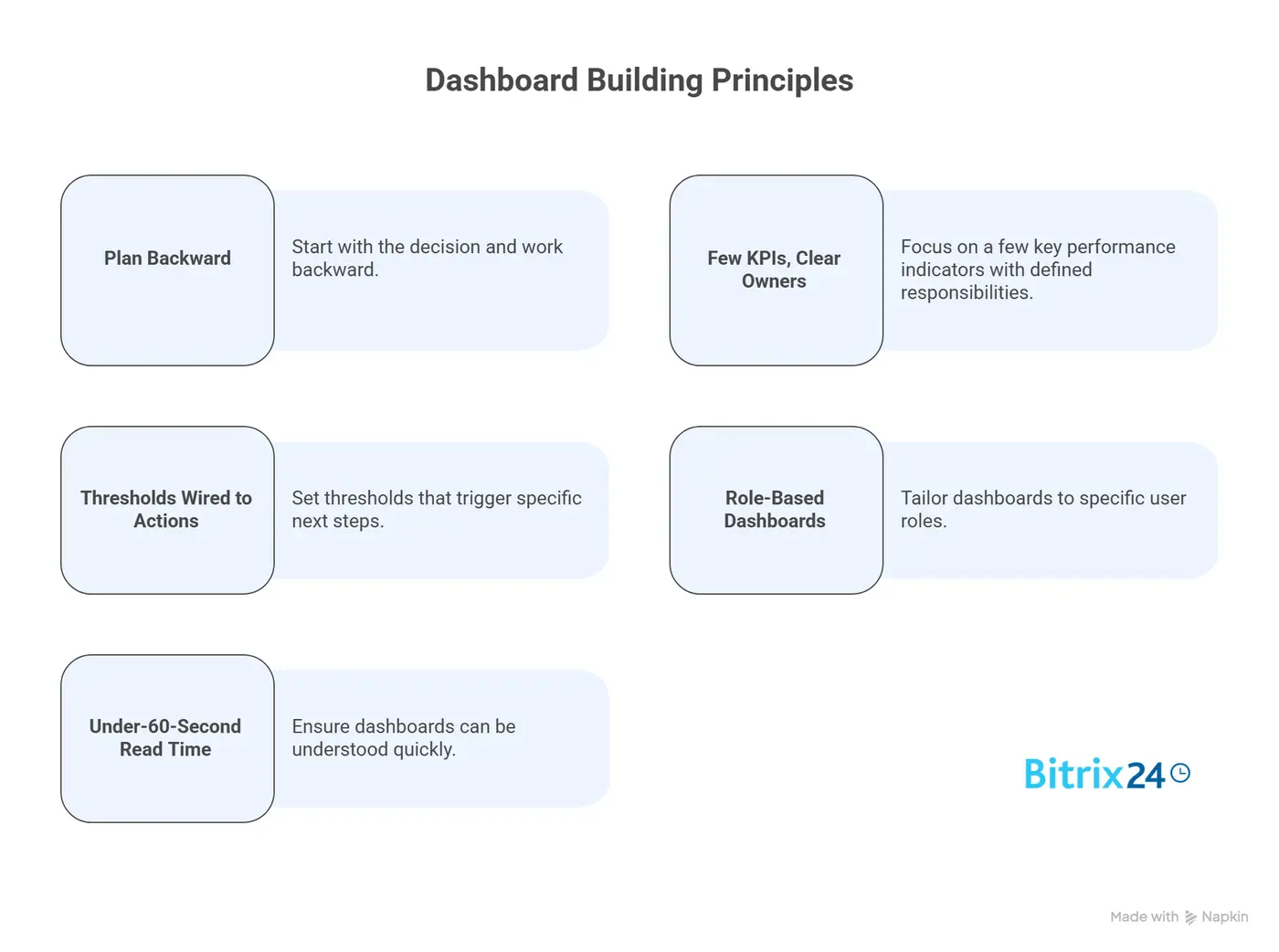
Five Principles for Building Actionable Dashboards
The five principles below come from teams that actually use their reports - sales orgs that hit forecast, support teams that hit SLA, and finance teams that close on time. None of this is theoretical. It is what survives contact with a busy week.
1. Plan Backward From the Decision
Start the dashboard build with one question: what decision will the user make from this screen, and how often? If the answer is fuzzy, the dashboard will be too. A weekly pipeline review needs different numbers than a daily standup or a monthly board update.
Most dashboard projects start with "what data do we have?" instead of "what call does this person need to make on Tuesday?" Reverse the order, and three quarters of the noise disappears before the first chart is built.
2. Few KPIs, Clear Owners
A dashboard with more than five to seven KPIs on the main view is rarely read in full. The eye picks two or three numbers and ignores the rest. Pick the two or three on purpose, and put a name next to each one. Owner means a single person whose job is to react when the metric moves - not a team, not a Slack channel, a person.
Sales reporting tools are particularly prone to KPI bloat - every region, segment, and product line wants its own number on the screen. Resist. Build separate dashboards for separate roles instead of one mega-dashboard.
3. Thresholds Wired to Next Actions
A KPI on a screen is a number. A KPI with a threshold and an action is a system. Set the line where the metric becomes a problem - say, response time over four hours, or pipeline coverage under 3x quota - and wire the dashboard to do something when the line is crossed. That something can be a task assigned to the owner, a notification, or a flag on a manager's view. The point is that drift triggers movement, not just a redder number.
Automatic KPI alerts are where business intelligence tools earn their keep. Without them, a metric drifts for a week before anyone notices. With them, the right person sees the problem the moment it becomes one.
4. Role-Based Dashboards, Not Functional Ones
A dashboard for managers is not the same as one for individual contributors. Build for the role, not the department. The sales rep wants to know which deals to push today. The sales manager wants to know which reps need help. The VP wants to know whether the quarter is going to land.
Same data, three different views. Most KPI dashboard creation projects in business intelligence tools skip this step and end up with a single screen that nobody can use without filtering. Pre-built role views beat self-service filtering for adoption.
5. Under-60-Second Read Time
If a busy person cannot get the answer they came for in under a minute, the dashboard is too crowded or too deep. A clean rule of thumb: headline number first, trend second, breakdown third, drill-down hidden behind a click. Most dashboards invert this and bury the headline under filters, legends, and explanatory text.
Test it the cheap way. Show the dashboard to someone who has not seen it before, time them, and ask what action they would take. If they cannot answer in sixty seconds, cut something.
What One Sales Team's Monday Dashboard Actually Looks Like
Principles are easier to argue with than examples. Take a regional sales manager at a 40-person SaaS company. She runs her team huddle every Monday at 8:30 AM, and her dashboard has six tiles, sixty seconds of reading time, and four messages sent before the call even ends. Each tile carries the metric, the line where it becomes a problem, the person who owns the response, and what they do when it triggers. Here is what sits on each one.
Tile 1: Quota attainment, current quarter. The headline number: quota committed plus closed-won, against pace. Green at pace, amber within 10%, red below. Owner: the manager. Action when red: open the pipeline tile and find the gap.
Tile 2: Pipeline coverage ratio. Open opportunity value divided by remaining quota gap. Below 3x, the quarter is at risk. Each rep gets a line under the team total. Owner: the manager for the team number, each rep for their own. Action when below 3x: a 30-minute pipeline build session that week.
Tile 3: Deals slipping past close date. A count of opportunities whose close date has moved by more than seven days in the last week, with names listed below. Owner: each rep for their own deals. Action: a follow-up task is auto-assigned, due Wednesday, requesting a fresh forecast call.
Tile 4: Reps with under five active opportunities. A red-flag list. Thin pipelines stand out before the gap shows up in revenue. Owner: the manager. Action: a one-on-one within the week, focused on prospecting.
Tile 5: Win rate by lead source, last 90 days. A horizontal bar chart, three or four sources max. Owner: the RevOps lead. Action when a source drops more than 5 points: pause spend or message the RevOps person.
Tile 6: Forecast variance, last four weeks. Committed forecast versus actual close, week by week. Catches sandbagging or wishful thinking before it tanks the quarter. Owner: the manager. Action when variance widens: tighter forecast calls with each rep.
That is the entire dashboard. No vanity metrics, no activity charts, no graphs that look impressive in a screenshot but never inform a decision. Each tile points at something specific the manager can do that morning, and the full review fits in a single screen.

Comparison Table: Dashboard Types and When to Use Them
Different decisions call for different dashboard formats. The table below maps the four most common types of business intelligence reporting against the questions they answer best.
|
Dashboard Type |
Best For |
Update Cadence |
Typical KPIs |
Watch Out For |
|---|---|---|---|---|
|
Operational dashboard |
Daily team standups, support queues, live pipeline |
Real-time or near real-time |
Open tickets, response time, deals in stage |
Alert fatigue if thresholds are too tight |
|
Analytical dashboard |
Weekly performance reviews, trend analysis |
Daily or weekly refresh |
Conversion rates, win/loss, cohort retention |
Easy to overload with charts; pick three trends max |
|
Strategic dashboard |
Executive reviews, quarterly planning |
Weekly or monthly |
Revenue vs plan, NRR, forecast accuracy |
Risk of becoming a slide deck instead of a working tool |
|
Self-service dashboard |
Ad-hoc analysis by individual contributors |
On demand |
Custom queries on shared data |
Without governance, the same metric gets defined three ways |
The rule of thumb: match the dashboard type to how often the user makes the decision. A daily decision needs an operational view. A quarterly decision does not need a real-time refresh.
Limitations and Common Mistakes in Business Intelligence Dashboards
No dashboard strategy works in every situation. A few honest caveats worth flagging.
Business intelligence tools are only as good as the data underneath them. If the CRM is half-populated and reps log activity inconsistently, no dashboard will save the situation - it will just make the bad data more visible. Fix data hygiene first.
Performance indicator dashboards do not work well for highly creative or low-repeatability work. A ten-person product design team does not need a Kanban velocity chart. Forcing one creates the appearance of measurement without the substance. Reserve dashboards for processes with enough volume to spot trends.
For teams of five or fewer people, BI for small businesses often looks like a well-organized spreadsheet paired with a couple of automated reports, not a full BI platform. The overhead of a dedicated BI stack tends to outweigh the benefits until the team or the data reaches a certain scale.
Three rollout mistakes show up over and over. First, building the dashboard for the person who asked for it instead of the person who will use it - usually, a senior leader requests something a frontline manager has to live with. Second, treating the launch as the finish line. A dashboard is a habit, and habits need maintenance. Third, refusing to remove KPIs once they are added. The default should be removal until the metric earns its place.
CRM analytics reports in particular suffer when the team adopts a new sales process and forgets to update the dashboards. The result is a screen that measures the old playbook with everyone running the new one. Schedule a dashboard review every quarter, regardless of whether anything seems broken.
Make Dashboards a Working Tool, Not a Trophy Case With Bitrix24
Bitrix24 brings the three pieces an actionable dashboard needs into a single workspace, removing the integration headache that usually slows BI rollouts. The platform's CRM analytics include pre-built sales reports - pipeline by stage, win rates by source, forecast variance - that start delivering value as soon as your CRM has consistent data. The BI reports run inside the same workspace your team already uses, with data flowing in directly from CRM activity, so the first charts are usable from day one.
For teams that need their own metrics, custom dashboards inside Bitrix24's business intelligence tools let you assemble views from data already in the platform - deals, support tickets, time tracking, and team task reporting - without leaving the workspace. A regional sales manager can build a Monday-morning view in an afternoon. Role-based access keeps the right people seeing the right numbers.
The action layer sits one level deeper, inside the CRM itself. Rather than the dashboard firing alerts when a number turns red, automation rules and triggers react to events in the workflow - a deal sitting idle past a defined time in a stage, a lead with no follow-up, a task running overdue. The rule assigns the next task, notifies the owner, or moves the deal forward. The dashboard then surfaces the resulting state: which reps are slipping, where coverage has thinned, whose forecast quietly shifted. The two layers work together - the CRM nudges in the moment, and the dashboard catches the pattern over the week.
Sign up for a free Bitrix24 account and connect your CRM data to a working dashboard the same day.
Revolutionize your BI Process with Bitrix24
Transform your business with Bitrix24's comprehensive BI tools. Streamline decision-making, foster productivity and get actionable insights from your data. Experience swift and insightful reporting today.
Get Started NowFAQs
Which Bitrix24 reports matter most inside business intelligence tools with actionable dashboards?
The Bitrix24 reports that matter most for actionable dashboards are pipeline by stage, win/loss by source, forecast variance, agent workload, and SLA compliance. These reports give a sales lead and a support lead enough insight to run their week without having to open multiple tools.
How do you prevent bloated dashboards in business intelligence tools?
Preventing bloated dashboards starts with a hard cap of five to seven KPIs on the main view, combined with a quarterly review where any unused metric is removed by default. Treat dashboard space as expensive real estate. If a chart has not been clicked or referenced in a meeting for ninety days, it goes.
Can business intelligence tools with actionable dashboards alert the team when a KPI drifts?
Yes - business intelligence tools with actionable dashboards can alert the team automatically when a KPI drifts past a defined threshold. Set the line, name the owner, pick the channel (task, email, in-app notification), and the system handles the rest. This is the single feature that separates a working dashboard from a wall poster.
What makes a dashboard a habit rather than decoration?
A dashboard becomes a habit when it answers a recurring decision, has a clear owner per metric, and is short enough to read in under a minute. Decoration occurs when the dashboard tries to cover everything rather than point to a decision. Build for the weekly call, not the annual report.
Which KPIs belong on a sales dashboard versus a support dashboard?
Sales dashboards should track pipeline coverage, win rate, average deal size, sales cycle length, and forecast variance. Support dashboards should track first response time, resolution time, SLA compliance, ticket backlog, and customer satisfaction. Mixing the two on one screen confuses ownership and dilutes the call to action.
How often should dashboards and KPIs in business intelligence tools be reviewed?
Dashboards and KPIs in business intelligence tools should be reviewed every quarter, with a sharper review whenever the team changes a process, a target, or an organizational structure. The review is not about adding charts - it is about cutting the ones that stopped earning their place.